Adding Borders to Clipped Shapes in CSS

Introduction
CSS clip-path is a powerful tool for creating non-rectangular shapes, like hexagons, triangles, or custom polygons. However, one common frustration is that standard borders (using the border property) don’t play nicely with clipped elements. The border gets clipped along with the content, or it doesn’t conform to the shape at all. This leads to hacks and workarounds.
In this post, I’ll dive into a clever technique for adding a border to a clipped hexagonal box. I encountered this while styling a hexagon with text inside, and the solution—drawn from insights on Stack Overflow—involves layering shapes to simulate the border. The intuition is straightforward once you grasp it, and it’s reusable for any clipped shape. By the end, you’ll understand why it works and how to adapt it for future projects.
The Problem: Why Borders and Clip-Path Don’t Mix
Let’s start with the basics. Suppose you have a div styled as a hexagon using clip-path:
#hexagonal-box {
    width: 250px;
    height: 100px;
    background-color: #4F5962;
    clip-path: polygon(15% 0%, 88% 0%, 100% 50%, 88% 100%, 15% 100%, 0% 50%);
}
This creates a nice hexagon. Now, if you try adding a border:
#hexagonal-box {
    /* ... */
    border: 5px solid red;
}
It doesn’t work as expected. The border is applied to the rectangular bounding box before clipping, so you end up with a clipped rectangle border that doesn’t follow the hexagon’s edges. Even worse, the corners might look jagged or incomplete.
Clip-path essentially “cuts” the element after borders and backgrounds are rendered, so borders can’t hug the irregular shape. This is a limitation of CSS—borders are rectangular by nature.
The Intuition: Layering for a Faux Border
The key insight is to treat the border as a separate, larger shape layered underneath the main content. Instead of relying on the border property, we create an illusion:
- Create the “border” layer: Make a slightly larger version of the shape (e.g., the hexagon plus border width) and color it with your border color (e.g., red).
- Overlay the content layer: Place the original-sized shape on top, colored with the background (e.g., #4F5962), effectively “covering” the inner part of the larger shape. This leaves only the outer rim visible as the border.
- Position precisely: Adjust dimensions, positions, and clip-path percentages to ensure the overlay aligns perfectly, creating a uniform border width.
This mimics how borders work on rectangles but adapts it to polygons. It’s like drawing a bigger outline and filling the inside with the content color.
Why does this work?
- Clip-path allows precise control over polygon points, so scaling the shape uniformly expands it like a border.
- Using absolute positioning (e.g., via ::before or a child element) keeps everything contained.
- It’s performant and doesn’t rely on SVGs or images, staying pure CSS.
This technique scales to other shapes too—triangles, stars, etc.—as long as you can define a larger clip-path version.
Code Breakdown: Implementing the Hexagonal Border
Here’s the full working example. We’ll use the ::before pseudo-element for the content layer (inner hexagon) and the main element for the border layer (outer hexagon).
HTML Structure
Keep it simple—just a div with an h2 for centered text:
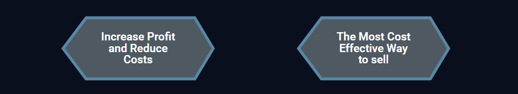
<div id="hexagonal-box">
    <h2>Increase Profit and Reduce Costs</h2>
</div>
CSS Implementation
#hexagonal-box {
    position: relative;
    width: 262px; /* Original width + 2 * border width (250 + 2*6) */
    height: 110px; /* Original height + 2 * border width (100 + 2*5) */
    background-color: red; /* Border color */
    margin: 57.74px 0; /* Adjust for pseudo-elements if needed */
    clip-path: polygon(15.74% 0%, 87.41% 0%, 100% 50%, 87.41% 100%, 15.74% 100%, 0% 50%);
    text-align: center;
    color: #333;
    border-radius: 15px; /* Optional: Smooth corners */
    overflow: hidden;
}

#hexagonal-box::before {
    content: "";
    position: absolute;
    z-index: 1;
    left: 6px; /* Half border width, adjusted for alignment */
    top: 5px; /* Border width */
    width: 250px; /* Original width */
    height: 100px; /* Original height */
    background-color: #4F5962; /* Inner background color */
    clip-path: polygon(15% 0%, 88% 0%, 100% 50%, 88% 100%, 15% 100%, 0% 50%);
    border-radius: 15px; /* Match smoothing */
}

#hexagonal-box h2 {
    position: absolute;
    top: 50%;
    left: 50%;
    transform: translate(-50%, -50%);
    margin: 0;
    font-size: 1.2em;
    z-index: 2; /* Ensure text is on top */
}

/* Optional: Additional pseudo-elements for triangles or effects */
#hexagonal-box::after {
    content: "";
    position: absolute;
    width: 0;
    border-left: 100px solid transparent;
    border-right: 100px solid transparent;
    top: 100%;
    border-top: 57.74px solid #ADD8E6; /* Example for a bottom triangle */
    border-radius: 15px;
}
Key Adjustments Explained
- Dimensions: For a 5px border, increase width by ~12px (5px * 2 sides, but tuned to 262px for precision) and height by 10px. Test visually, as polygons aren’t perfectly uniform.
- Clip-path Percentages: The outer hexagon uses slightly adjusted percentages (e.g., 15.74% instead of 15%) to expand proportionally. Calculate these by factoring in the border width relative to the size.
- Positioning: The inner layer (::before) is offset by the border width (left: 6px, top: 5px) to center it. Use z-index to stack correctly.
- Overflow and Radius:
overflow: hiddenandborder-radiushelp with any clipping artifacts or smoothing.
This code is adapted from a Stack Overflow discussion (link in references), where the community highlighted this layering approach as a reliable workaround.
Potential Enhancements and Adaptations
- Variable Border Width: Make widths dynamic with CSS variables (e.g.,
--border-width: 5px;) and calc() for sizes. - Other Shapes: For a triangle, define a larger polygon and overlay the smaller one. The math is similar—scale points outward.
- Performance Tip: Avoid overusing pseudo-elements; for complex pages, consider a wrapper div instead.
- Browser Compatibility: Clip-path works in modern browsers, but test in Edge/IE if needed (polyfills exist).
If you need a dynamic border color or animations, this method extends well—animate the background colors or scales.
Conclusion
The intuition behind bordering clipped shapes is all about optical illusion through layering: a big colored shape minus a smaller inner one equals a border. It’s elegant, CSS-native, and versatile. Next time you hit a clip-path border snag, refer back here—tweak the sizes, adjust the polygons, and layer away. Happy styling!
References
- Stack Overflow: How to add border in my clip-path: polygon css style
- MDN Web Docs on clip-path for deeper dives.
Posted on July 27, 2025

